For most websites today, the recommended body text size is around 16 pixels. Headlines should be larger, sometimes twice as big, depending on their importance. Mobile screens need slightly larger fonts than desktop screens because people hold phones closer to their faces.
There’s real research behind these numbers. Studies show small text causes eye strain and makes people bounce off your page faster. But text that’s too large looks amateurish and wastes space.
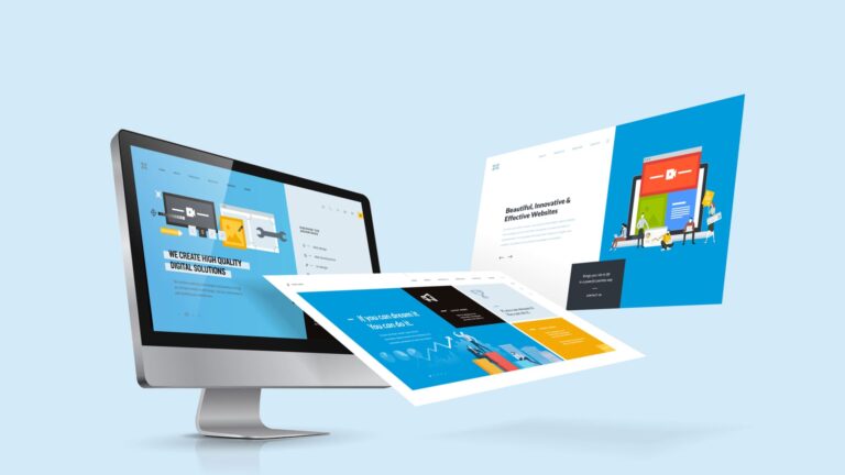
Let the Web Experts at Site Architects explain the best font sizes for web pages, headings, subheadings, mobile sites, and even for print.
Why Does Font Size Matter So Much?
If your text is too small, people have to squint or zoom in. If it’s too big, the page feels messy and unprofessional.
Poor typography causes:
- Eye strain
- Slower reading
- Higher bounce rates
According to the Nielsen Norman Group, people read about 25% slower on screens than on paper. So good font size and clear text are critical for web design.
Recommended Font Sizes for Websites
Let’s break it down for each part of a website.
Body Text: Your Core Content
- Recommended size: 16px
- Works well for most people’s eyesight
- Easy to read on desktop and mobile screens.
Some designers prefer slightly larger sizes, like 18px, especially for blogs or long articles. The larger size decreases eye strain during prolonged reading sessions.
Medium.com uses body text around 18px for readability because users spend time reading long stories there.
Headings: Structure and Emphasis
Headings help readers scan your page quickly. They show what’s important and help break long pages into sections.
Here’s a practical size range:
- H1 (Main Title): 32px – 48px
- H2: 24px – 32px
- H3: 18px – 24px
- H4: 16px – 20px
Make sure there’s enough size difference between body text and headings. This contrast makes pages look organized and professional.
On Site Architects’ web development page, headings are large and clear, which makes it easy for users to find information fast.
Subheadings: Extra Clarity
Subheadings usually sit between body text and main headings. They’re smaller than H2 but still larger than body text. Good subheadings might be:
- 18px – 24px on desktop
- 16px – 20px on mobile
Is 14px Too Small?
Many people wonder if 14px is acceptable. It depends on context.
- For body text, 14px is usually too small for comfortable reading.
- For labels, footnotes, or captions, 14px might be fine.
Older readers or users on high-resolution screens can struggle with small text. A study by Baymard Institute shows that small text is one of the top complaints users have about e-commerce sites.
So, for body paragraphs, stick to 16px or bigger.
Font Size for Print
Print is different from screens. The best print sizes are:
- Body text: 11pt – 12pt (equivalent to around 14px – 16px on screens)
- Headings: 14pt – 18pt or more, depending on layout
Tiny text on paper can look sharp but is hard to read, especially for longer documents like reports or brochures.
Many printed books use around 11pt for body text because it saves space yet remains readable.
Font Size for Mobile Websites
Mobile screens are smaller, but that doesn’t mean shrinking your text. In fact, text might need to be slightly larger so users don’t zoom in.
- Body text: Minimum 16px
- Headings: Minimum 18px – 24px
Apple’s Human Interface Guidelines suggest using at least 16px for body text. Google’s Material Design agrees.
Test your mobile site on real devices. What looks fine in a desktop preview might feel tiny on an actual phone.
UI Font Size Guidelines
If you’re designing buttons, menus, or input fields:
- Minimum 14px for small UI labels
- 16px – 18px for main UI text
- Buttons and clickable places should be large enough to tap without accident
WCAG (Web Content Accessibility Guidelines) recommends scalable fonts so users can zoom in without losing layout or readability.
What is the Most Attractive Font for Websites?
Style isn’t the only aspect of attractiveness. It has to do with readability as well. Popular fonts for websites are:
- Sans-serif fonts (modern, clean)
- Open Sans
- Roboto
- Helvetica
- Serif fonts (classic, elegant)
- Georgia
- Merriweather
Many designers choose sans-serif fonts because they look crisp on screens. But serif fonts can look classy and professional for editorial websites.
How to Choose the Right Font Size? 5 Expert Tips
According to web design trends in 2025, here’s how to pick font sizes that actually work for real people, not just for pretty mockups:
Start with 16px for body text.
This is the size most people can read comfortably without zooming in. It’s become a standard for a reason: it works across most devices and screen resolutions.
Make headings at least 1.5 to 2 times larger.
Try using 24px or 32px for the primary headers, for instance, if your body text is 16px. Bigger headings help people scan your page and understand what’s important.
Test your website on different screens.
Check how your text looks on a laptop, tablet, and phone. What seems perfect on a large monitor can look tiny on a small mobile screen.
Think about older users or anyone with weaker eyesight.
Many people over 40 find smaller text tiring to read. Consider slightly larger fonts if your audience skews older, or if your website has long articles.
Adjust your line height.
The distance between text lines is known as “line height.” It feels constrained if it’s too tight. A good rule is about 1.4 to 1.6 times your font size, for instance, 16px text might need around 24px line height. This extra space makes paragraphs easier to read.
Good typography doesn’t shout for attention, but it makes your website feel polished, modern, and easy to use. Bad typography makes people leave because reading becomes a chore.
Typography is invisible when done well, but painfully obvious when it’s done badly.
Conclusion
For websites, 16px for body text is a safe choice. Headings should be larger so users can navigate easily. For mobile and print, adjust sizes to keep text readable without forcing people to zoom in or strain their eyes.
Want a website that’s not only beautiful but also easy to read? Check out our web development services at Site Architects.
People Also Ask
Which font size is ideal for a website?
The ideal starting size for body text is 16 pixels. Most people find it pleasant on both desktop and mobile devices. To provide a clear page structure, headings should be larger.
Is font size 11 or 12 better for websites?
Neither is great for websites. Those sizes are fine for printed text but too small for most screens. Stick to at least 16px online.
Is font 14 too small for websites?
Yes, for body text. It might be okay for footnotes or labels, but for reading long paragraphs, 16px or more is safer.
Which typeface is the most visually appealing for websites?
Fonts with serifs, such as Roboto and Open Sans, are visually appealing and simple to read. Georgia and other serif fonts are ideal for editorial websites.