Most responsive sites still lean on viewport media queries. That works until a component lands in a tighter column or a wide card rail. The viewport might be huge, yet the component’s box is not. CSS container queries fix that mismatch. Instead of asking how wide the screen is, they ask how much space the component actually has. Cards, nav bars, feature panels, and product tiles can now resize themselves in context. The result is simpler CSS, fewer one off overrides, and layouts that feel deliberate rather than patched.
What container queries solve
Viewport breakpoints treat the page as a single canvas. Real pages are grids of boxes. A hero banner and a sidebar widget should not make decisions from the same screen width. Container queries let each component respond to its nearest container. A card can switch from stacked to split when its parent gets past 420 pixels. A sidebar promo can hide art and keep copy when space gets tight. This removes the guesswork that leads to brittle utility classes and hard coded width hacks.
The core ideas in plain English
First, you declare a container. That tells the browser this element defines a sizing context for its children. The most common setting is container type inline size, which responds to the container’s width in writing mode. You can name containers to target them more easily. Inside the component, you write container query rules that look a lot like media queries, but they reference the container rather than the viewport. The browser evaluates those rules as the parent grows or shrinks, so the component adapts without listening to the whole page.
Planning a container first design system
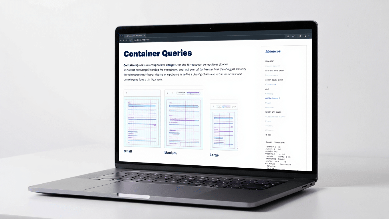
Start by listing components that repeat across templates. Cards, pricing tiles, product summaries, testimonials, and callouts are good candidates. Give each a clear set of states based on space. For a card that might be three states. Narrow stacks content. Comfortable shows image and text side by side. Roomy adds metadata or actions. Map those states to size tokens rather than random pixel values. When tokens live in your design system, components stay consistent even as you refine spacing or type scales.
Patterns you can ship this week
A card grid often breaks at the edges of the design. Wrap each card’s parent with a container and let the card swap layout when its own space crosses a threshold. A sidebar widget can drop a decorative image and tighten spacing when the column is slim, then bring those pieces back when the column grows. A top navigation can compress to an icon row inside a narrow header area even on a large monitor if the logo and utility links take space. Forms can switch from two columns to one inside a narrow panel without touching global breakpoints.
Writing maintainable queries
Keep thresholds simple and meaningful. Use one or two breakpoints per component instead of a ladder of tiny steps. Prefer inline size so your logic reads as width based across writing modes. Co locate queries with the component styles so future maintainers see the whole story in one place. Name containers where it helps, but avoid a sprawling set of bespoke names. If two components share similar behavior, share tokens and thresholds, not copy pasted rules. Comments with a short description of each state help new team members ship changes without breaking intent.
Performance and accessibility benefits
Cleaner rules mean fewer overrides and less CSS shipped to the browser. Components that adapt in place reduce the risk of layout shifts that frustrate readers. You can also reduce script that measures boxes at runtime. When styles react to container size, the browser does the heavy lifting during layout, which keeps the main thread free for interactions. Accessibility improves because you are not hiding essential controls in unpredictable places. Buttons stay visible when space permits and collapse gracefully when space does not.
WordPress specifics that make adoption smooth
Block themes give you natural containers. Group, Columns, and Template Parts already wrap content with clear boundaries. Assign a container type to those wrappers in your theme styles so child blocks can query them. Use theme.json for scales and tokens so your container states pull from a single source of truth. When you build patterns for editors, document how a component behaves at each state so content authors do not fight the design. If a plugin injects heavy markup, consider a light wrapper container around its output so your styles still respond predictably.
Working with legacy or classic themes
You can adopt container queries without a complete rebuild. Identify a few critical wrappers such as main content, sidebar, and card rails. Add container declarations there and migrate one component at a time. Replace brittle viewport rules in that component with container based logic. Test on the templates where the component appears. Over a few sprints the old breakpoint ladder shrinks and your stylesheet becomes easier to reason about. This is a practical path for large sites that cannot pause feature work.
Testing and QA that mirrors reality
Use DevTools to inspect which containers are active and which queries have matched. Resize only the container in a local prototype to see how the component behaves without the noise of a full page. On staging, test templates with different column widths, not only different screens. Check how components behave inside carousels, tabs, and accordions where space can change after load. Verify that images have intrinsic dimensions so the layout stays stable as sources swap between states. Keyboard through interactive components to ensure focus order still makes sense as layouts shift.
Common mistakes and how to avoid them
Forgetting to declare a container is the number one cause of confusion. The query will not fire if there is no container in the ancestor chain. Over nesting containers can create surprising cascades of changes. Keep the hierarchy shallow and predictable. Do not use a different token scale inside each component. That fractures the system. Avoid hard coded pixel gaps that drift from your spacing scale. If you catch yourself adding a viewport media query to fix a container based bug, pause and check whether the container thresholds or structure are the real issue.
A simple rollout plan for teams
Pick one component that appears everywhere, such as a card. Add a container to its parent and rewrite the component with container queries. Measure CSS weight and test across templates. Share a short before and after demo with designers and editors so they see why the change matters. Next, migrate a layout pattern like sidebar widgets or feature panels. Finally, update your component starter files and documentation so new work starts container first. Momentum builds quickly because each migration removes a pile of overrides you no longer need.
The takeaway
Container queries align CSS with how modern sites are built. Components make decisions from the space they actually have, not from the size of the window. That shift reduces complexity, tightens design consistency, and improves perceived quality. You can roll them into a WordPress or custom stack with a few small changes and a clear plan. Start with a single repeating component, use tokens, keep thresholds simple, and let the browser handle the rest. The site will feel calmer, more polished, and easier to evolve as content and layout demands change.
Also Read: View Transitions in WordPress: Smooth Page Animations