Is your business website struggling to gain traction? Your site’s usability could be the culprit.
A strong online presence is essential, but if your website is difficult to navigate or slow to load, potential customers may leave before engaging with your content. The good news? You don’t need to be a web design expert to improve your site’s user experience.
Here are some simple yet effective tips to ensure your website is as user-friendly as possible.
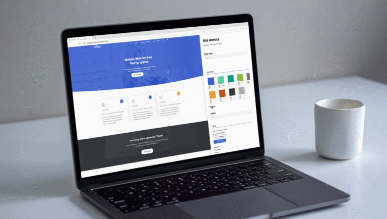
Top Tips For A Responsive and User-Friendly Website
1. Build With a Mobile-First Mentality
Your website should be designed for mobile users first. A mobile-responsive site ensures that content looks great and functions seamlessly on smaller screens, allowing users to browse effortlessly on the go.
Beyond user experience, search engines prioritize mobile-friendly sites, improving your rankings and visibility. Optimizing for mobile is no longer optional, it’s a necessity.
2. Keep Navigation and Layout Simple
Simplicity is key when it comes to navigation. A well-structured site helps visitors find what they need quickly without frustration.
- Use a clear and intuitive menu.
- Limit navigation choices to a few clicks.
- Ensure buttons and links are easy to find and understand.
A clutter-free design enhances usability and encourages users to stay longer on your site.
3. Prioritize Page Performance
A slow website can drive visitors away before they even see your content. Optimize your site’s performance by:
- Compressing images to reduce load times.
- Using a reliable hosting provider.
- Minimizing unnecessary scripts and plugins.
Fast-loading pages enhance user experience and improve your site’s search engine rankings.
4. Use High-Quality, Brand-Reflective Images
While text is important, visuals create the first impression. High-quality, brand-aligned images make your website more engaging and professional.
- Avoid generic stock photos—use authentic visuals that represent your brand.
- Optimize image sizes for faster load speeds.
- Maintain consistency in style and color to reinforce branding.
5. Focus on Quality Over Quantity
Instead of cluttering your site with excessive pages and content, focus on delivering high-quality, concise, and well-organized information.
- Prioritize user needs over unnecessary details.
- Keep content scannable with headings, bullet points, and short paragraphs.
- Ensure each page serves a clear purpose.
A streamlined website creates a better experience for users and keeps them engaged.
People Also Ask:
- How can I test if my website is mobile-friendly?
Use Google’s Mobile-Friendly Test tool or simply check your site on different devices to see how it responds. - What is an ideal website loading time?
Aim for under 3 seconds. Studies show that longer load times lead to higher bounce rates. - How often should I update my website’s design?
Every 2-3 years, or whenever user experience trends shift significantly. - What’s the best way to improve navigation?
Keep menus simple, use clear labels, and ensure important pages are easy to access. - How can I tell if my website is user-friendly?
Monitor user behavior with tools like Google Analytics, conduct user testing, and gather feedback.
Ready to Elevate Your Website?
Your website is often the first interaction potential customers have with your brand, make it count! By implementing user-friendly strategies, you can enhance engagement, improve performance, and boost conversions.
If you need expert guidance, Site Architects is here to help! Whether you require a complete website overhaul or minor tweaks to improve usability, our team is ready to assist you. Let’s create a website that works for you – contact us today!